
Trading Context - HTF Analysis
This post will cover how to map a market, identifying trend, and some basic techniques.

Introduction to HTF Analysis for Trading
Higher Time Frame (HTF) analysis is vital for making informed trades. Without it, navigating the market is akin to trading blindfolded. Below is a breakdown of essential trading concepts, with step-by-step guidance on using the right tools.
Tools Needed:
Charting software (e.g., TradingView, ExoChart, Velo)
HTF > LTF
Always prioritize higher timeframes (monthly > weekly > daily > 4 hr > etc). HTFs provide more data and volume per candle, making them more reliable for understanding market trends and momentum. Lower timeframe (LTF) candles contain less data, making them less informative for identifying major reversals or market trends.
If you see a strong green/red candle on the monthly chart, that single candle represents more volume than a week, day, or hours of trading. That simply indicates that traders during that monthly period were overwhelmingly buyers (green candle) or sellers (red candle), indicating strong momentum in that direction. When you’re looking for signs of top, bottom, reversal, etc., then a print on the higher timeframe is always going to be more informative than on a lower timeframe.
Key Tip: Always consider the size and close of candles. Full-body candles are stronger, while thin candles with wicks suggest indecision or weakness.

#2 Identifying the Trend
Identifying the overall trend (uptrend or downtrend) is critical. Use the highest timeframe possible, such as the monthly or weekly chart, to assess market direction. Avoid using LTFs for trend identification, as they can provide misleading signals.
To do this, you need to look at the highest timeframe: either the monthly or weekly chart. Sometimes the daily chart has to be used, especially if it’s a new token. If there isn’t any higher timeframe available, then technical analysis isn’t going to be very useful, e.g. for newer coins like $babydogshitinu.


Identifying Premium vs Discount
When you go shopping naturally you are looking for the best discount, right? And if you are looking to sell something you own, like a car, clothes, etc., naturally you want the best price, no? This same logic applies to markets. When smart money (since retail tends to buy tops and sell bottoms) are observing the chart and looking for entries, they are looking for the best discount (buyers/longs) or the best premium (sellers/shorts).
To identify Premium vs Discount is very simple and will combine the skills I mentioned above. To do this we are going to use the Fib Retracement tool. This can be found on the left sidebar of your charting software.

To draw this you are going to draw the fib tool from the swing low to swing high in an uptrend or swing high to swing low in a downtrend. Swing low/swing high is when the candles to the immediate left or right are higher/lower than the middle one.

Let’s look at Bitcoin’s monthly downtrend from 2017 to 2018. Using the Fibonacci tool from the 2017 high to the 2018 low, you’ll notice that BTC rejected at the 0.618 level (premium) and bounced near the 0.236 level (discount). This method offers a clear visualization of key areas where price reactions occur.

You can see that the fib tool has marked out numerous numbers but for now let’s just focus on the 0.5 level. Anything above 0.5 is considered premium whereas anything below 0.5 is considered discount. Presumably, when price hits below the 0.5 level it indicates a retracement level where a change in direction is likely to occur. Although of course you need to use this tool in conjunction with other methods in order to increase your accuracy.
In this case you can see that BTC is clearly in a downtrend on the monthly timeframe. Also notice that it bounced from the fib retracement levels many times, but continued down each following month. Finally it hit just below the 0.786 level — which also coincided with a bullish orderblock or support, which is the first red candle before the uptrend — where it bottomed over 4-5 months. In other words, it hit the deepest area of discount, which is where strong buying began again.
The next chart is drawn from the high of 2017 to low of 2018. I drew it from the high to the low to analyze the following uptrend. The following price action occured between 2018-2020.
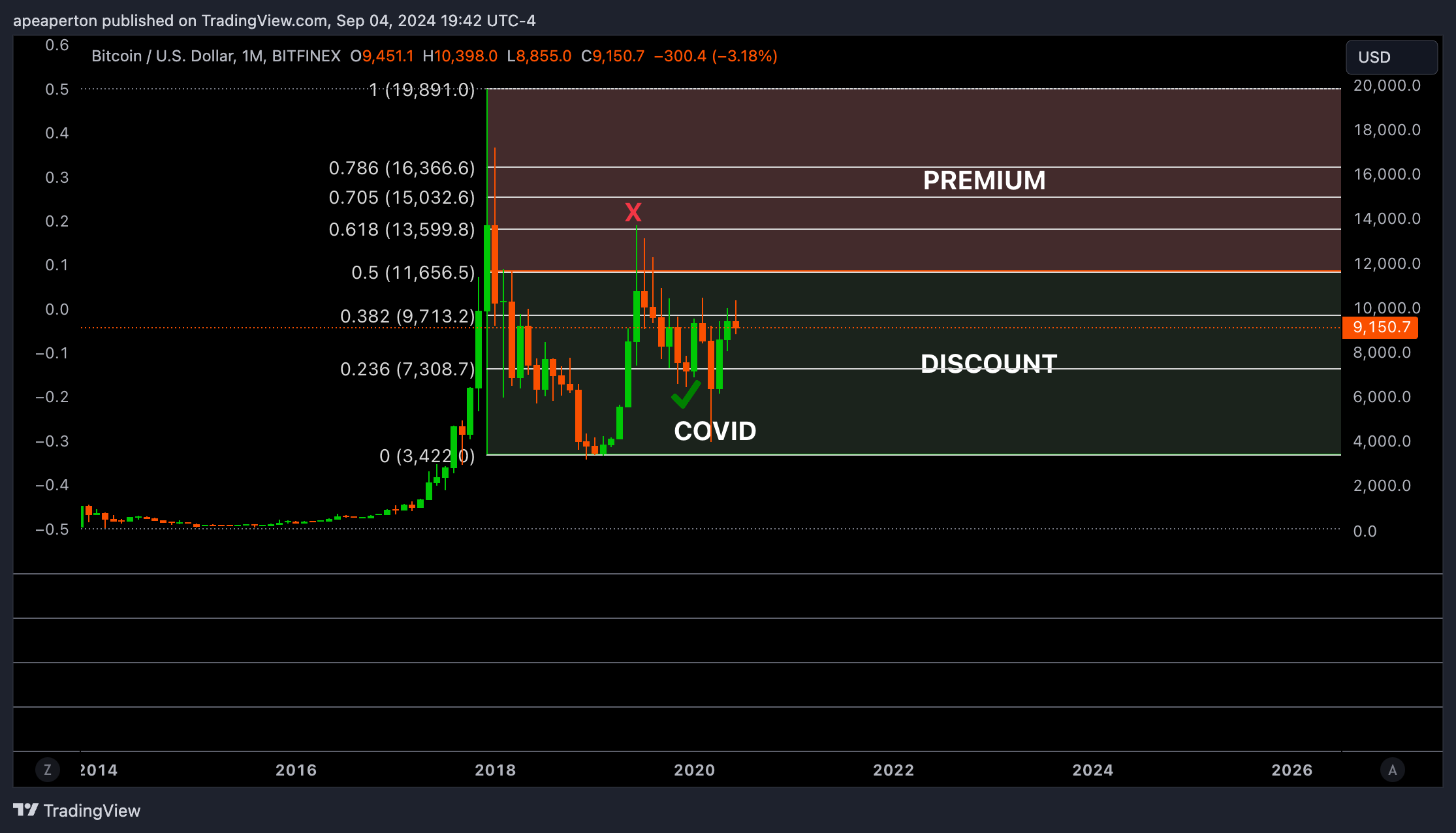
Now you can see how premium/discount works in action. You can see in the chart that it rejected once it touched the 0.618 level (premium) and bounced off the 0.236 level (discount). The reason I marked COVID on the chart is because that was a black swan event and otherwise I don’t believe the chart would have come anywhere close to the 2018 bottom. In any case, even with the black swan the price was still in discount which indicated a good buying level.
#4 Combining It All Together
Now that you’ve learned about higher timeframes, trends, and premium/discount using the fib tool, we’re going to combine them and use it across several timeframes.
When you begin to draw out this framework, think of premium/discount in graduated terms. You have to look at premium/discount for each timeframe.
Let’s say this is the monthly perspective

This is the monthly/weekly perspective

Finally this is the monthly/weekly/daily perspective

There can be areas of premium/discount on monthly, which provide selling/buying opportunities on the weekly, which provides swing trade setups on the daily, etc.
I’ll finish by showing an example for BTC. I’ll also simplify the fib to show only the 0.5 fib level. Again, above 0.5 = premium. Below 0.5 = discount.

Left chart is the monthly. You can see we are inside an area of deep discount.
Right chart is the weekly. You can see that we are in an area of premium. To figure this out I drew the fib tool from the previous swing high to the recent swing low, which reveals all the following areas of premium. Above 0.5 is where I could look for areas to sell/short.
Now let’s say you wanted to enter and ride the trend up!
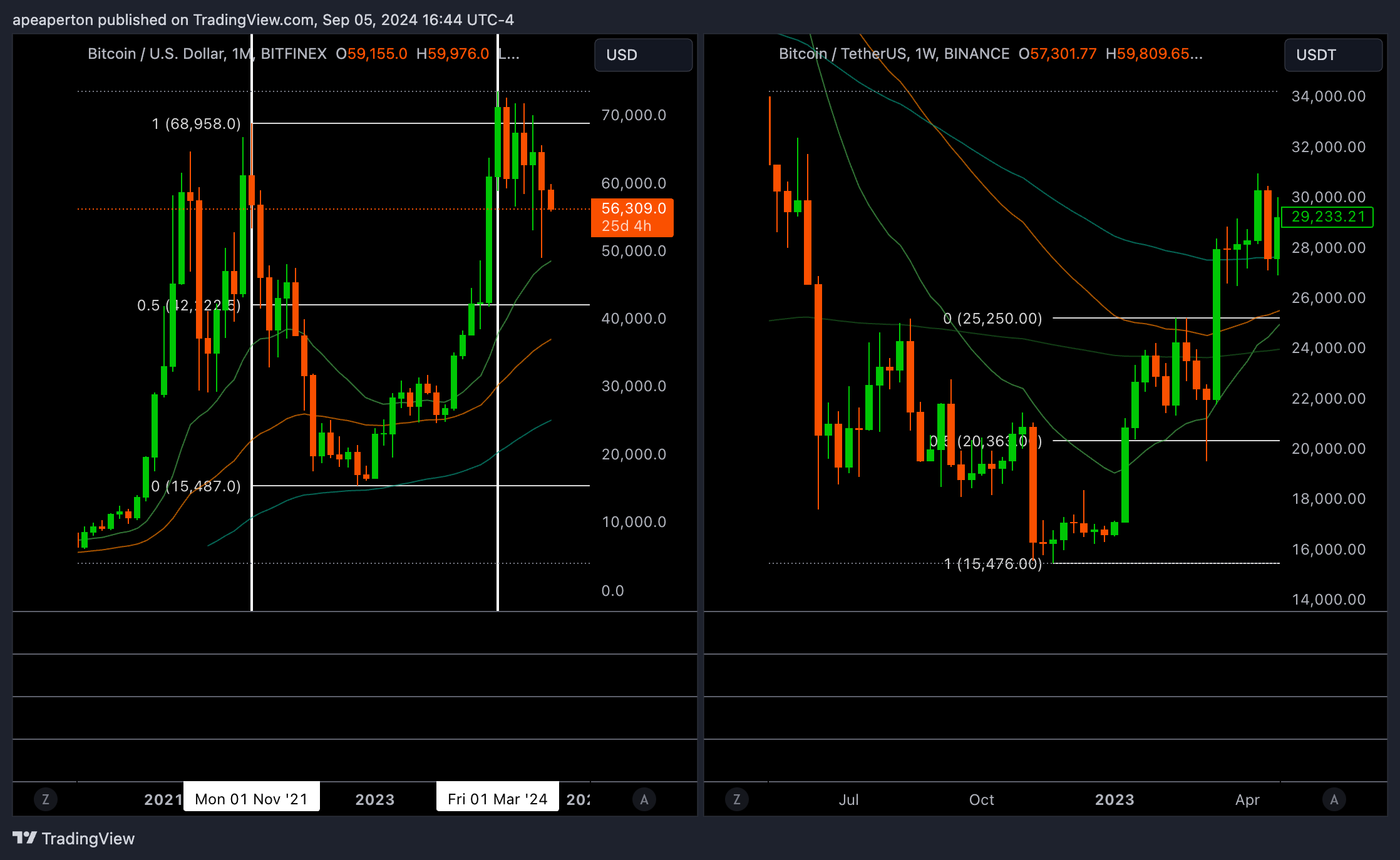
Here I just drew the fib from the last swing low to the next swing high. And again you see how we dipped below 0.5 before bouncing and continuing up.
You may be wondering: why didn’t it dip into further discount? This is where you have to combine the HTF & LTF. On the monthly chart price is at discount, but on the weekly it had entered premium. On the monthly chart we are still in massive discount, so buyers are simply looking for a place to get in before the price expands again! Price did bounce off a support at 22k, but at the time that was still considered premium on the weekly. It rejected 24k again and finally fell to around 20k which coincided with the 0.5 fib, before expanding to higher prices. At the end of the day, these are just tools. It still requires critical thinking and other methods to reach the right conclusions. For example, in this scenario you could have combined the fib tool with orderblocks or support/resistance levels to determine the optimal area for longs.
In the following posts I’ll describe how to find confluence with other tools/indicators and using intermarket analysis to further enhance your perspective. By combining all of these is how you improve the probability of being on the right side of the trend and increase your profitability!
Supplementary Material:
To learn more about PD Arrays (Premium/Discount Arrays) and HTF analysis you can check these out:
ICT 2016 Mentorship Month 06 - Covers PD Arrays & HTF setups
ICT 2016 Mentorship Month 06 Notes - Notes for the videos